PERFECTLY PITCHED BRANDING
Entering what appeared to be an already crowded market of kitchen brands within Home Depot, we had to pitch it just right to win the hearts and minds of US consumers.
Going up against the big box big boys Kraftmaid and American Woodmark, our brief from client Magick Woods was to help them develop a strong, memorable brand with a contemporary twist; to appeal to America’s modern home-improvers of all ages.
What was the brand proposition? Cabinetry that over-delivers on quality vs price, starting with a minimal choice of trend-leading finishes, with must-have features and is easy to install. How to package this into a memorable brand?
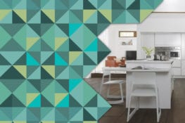
Perhaps we shouldn’t say this as brand specialists, but it’s not so much the name you choose but what you do with it and how you support it that makes the difference. It has to be considered as a whole. We positioned ‘J Collection’ as the smart buyer’s brand — the simple, intelligent choice for all the above reasons. The coolness of the chameleon-like brand is reflected not only in the logo itself, which takes on many forms to celebrate its uniqueness, from jazzy patterns to cool, neutral tones — but in its quirky web design, roomset imagery and in-store POP.
Disciplines
- Branding
- Digital